G.LALA
I receive a simple brief: G.Lala is the first F&B brand of the GREENFEED food chain, starting with Com Tam. “Lala” stands for “Lành, Lạ” (means goodness & innovation).
Service
Branding, Packaging
Art Direction
Client
G.LALA
Year
2021

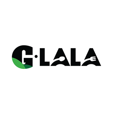
The Logo
Our G.Lala logo is a unified image in GreenFeed’s brand ecosystem, with the icon G from GreenFeed and G Kitchen. “Lala” which stands for “Lành, Lạ” was stylized the negative space from the letter A by the kitchen stuff icon, which presents the business fields of the company.
The corporate logo is presented through the use of color as well as shape and form. The two corporate colors are Dark Green and Cream Off-white color. It is a fresh and appealing blend of colors chosen for their strong combination - sustainability - eco friendly - timeless.


Identity & Packaging
Continuing the visual identity of G Kitchen, we use the illustration sketch as our main graphic style.
Add in some ideas about sustainability, we also mapped and enhanced every element of the design language, such as handcraft style, and eco-friendly material.


The Store
I supervise the interior agency and am fully in-charge in art direction for the whole project, which needs consistent with the brand image. I also take a role to design all the artwork in-store.


